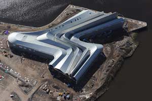
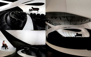
Zaha Hadid Architects has some stunning ideas and some excellent proposals — but the verbiage on each page about the structures is virtually content free. For example, “Collaborations with artists, designers, engineers and clients that lead their industries have advanced the practice’s diversity and knowledge, whilst the implementation of state-of-the-art technologies have aided the realization of fluid, dynamic and therefore complex architectural structures.” I picked out a few projects I like (there are also quite a few I don’t). The upper centre photo is “proposed to house 5 theatres – music hall, concert hall, opera house, drama theatre and 'flexible’ theatre with a combined seating capacity of 6,300. The Centre may also house an Academy of Performing Arts.” Wellington may not need this, but I would love it if they had something this distinctive on their waterfront. (But maybe that would make them copying Sydney in a way?) Upper right is an interactive exhibition area focusing on water sustainability, integrating a pedestrian bridge; it performed as the gateway for the Zaragoza Expo 2008. There are better pictures of this that I could have chosen, but, while it foreshortens it, this one seems to give a good overall perspective.
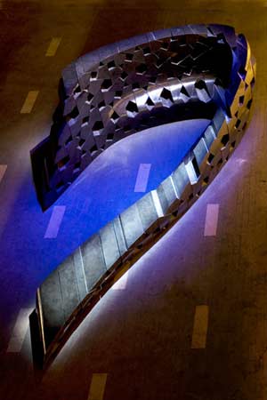
The bottom 3 are some of their somewhat smaller projects: a chamber music hall, a small pavilion, and a single floor hotel interior. The music hall is located at the Manchester Art Gallery. Specially designed to house Bach solo performances, a single continuous ribbon of fabric swirls around itself, creating layered spaces. Okay. Whatever. The installation is designed to be transportable and re-installed in other similar venues. A recyclable music hall? Cool. The pavilion in the centre is also a temporary structure, built to house a multimedia installation. It is an intricate bent-aluminium structure, with each element shaped and welded in order to create the curvilinear form. Outer and inner fabric skins are wrapped tightly around the metal frame; these also serve as a screen for video. The pavilion was designed and built to maximise recycling and re-use of materials after its role is done or it can be re-installed at other sites. Regarding the hotel: on this floor are 28 rooms, 2 suites, and common areas. The walls and furniture are all one continuous surface or skin. Every element – walls, bedroom door with LED signs, sliding door to the bathroom, the bathtub and vanity unit, bed, shelves, chair and cantilevered bench by the window (which doubles as a table) – is included in a single curved sweep. (I hope everything is unbreakable, cleanable, and hard to scratch.)
 Animals
 Animation
 Art of Playing Cards
 Drugs
Drugs Education
 Environment
 Flying
 History
 Humour
 Immigration
 Info/Tech
 Intellectual/Entertaining
 Lifestyles
 Men
Men Money/Politics/Law
 New Jersey
 Odds and Oddities
 Older & Under
 Photography
 Prisons
 Relationships
 Science
 Social/Cultural
 Terrorism
 Wellington
 Working
 Zero Return Investment


